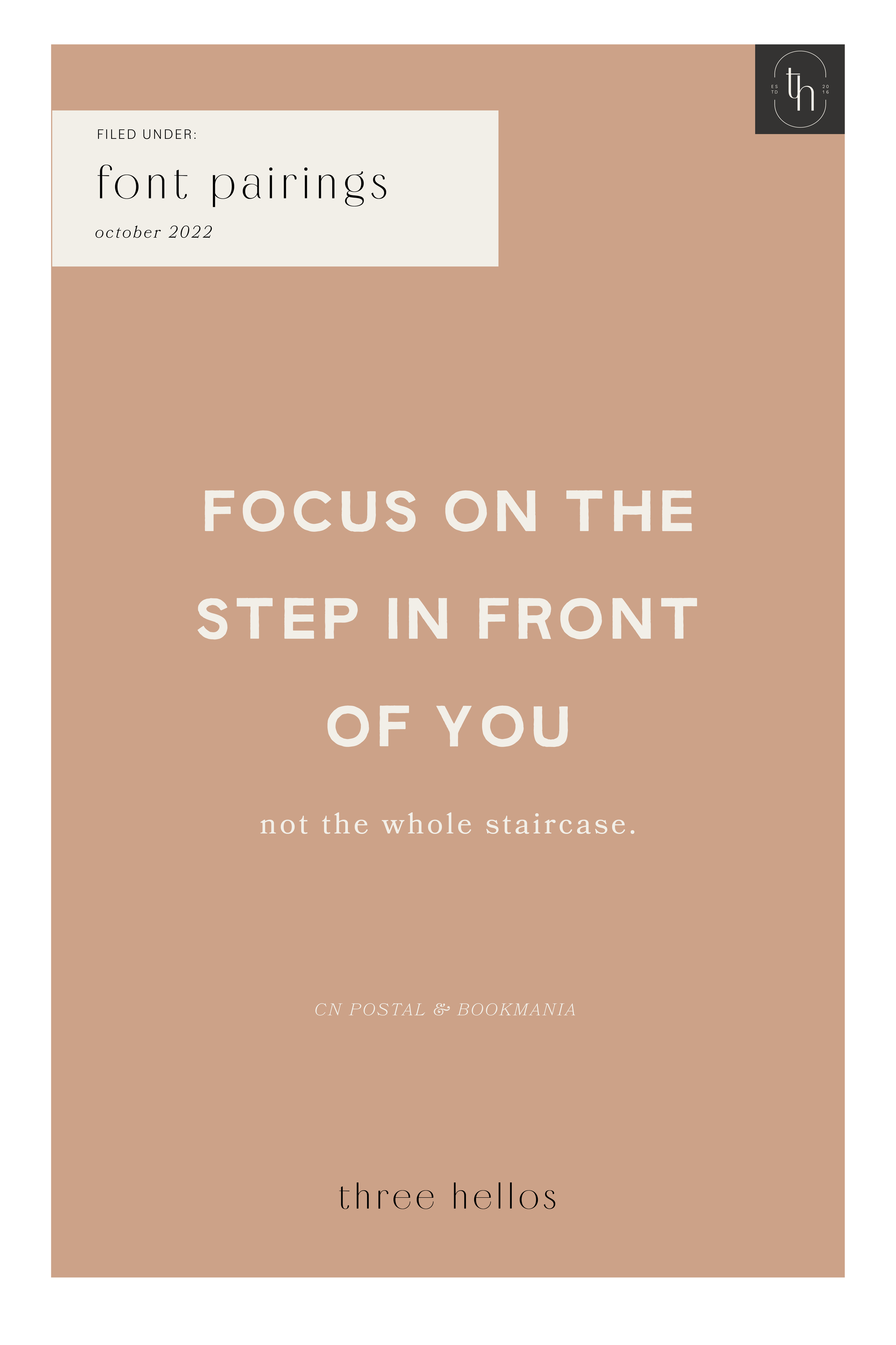
font faves - october 2022
No surprise if you’ve seen me on Pinterest, Instagram or browsed the blog, I have a huge affinity for fonts and typefaces. They can make or break your design so selecting the correct one to ensure you are reaching your target audience and your brand identity is remaining on track is vital.
I HAVE DONE A FEW SERIF AND SANS SERIF POSTS ABOUT MY FAVORITE FONTS, BUT I HAVEN’T SHARED ONE WITH PAIRINGS SO I THOUGHT THIS MIGHT BE HELPFUL.
Check out these pairings and see what you notice about each. I love pairing opposites. For example, in the graphic, you’ll notice that Montage (a more classic looking serif) is paired with Bilo (a minimalistic sans serif). This works well because if you want to use Montage for a headline, it’s more eye catching and demands the attention. Pairing it with a simpler sans serif allows that focus to remain on the headline instead of competing against it.
When selecting fonts or typefaces for graphics, web copy or branding, it’s vital to make sure to notice where the hierarchy is. You want to demand the attention on the most important aspects first and then let the audience naturally move downward.
Let me know if you like this pairing post and I will be sure to add another!
P.S. Bilo, Macho, Arboria and Bookmania are all on Adobe Fonts so if you’re an Adobe Creative Cloud user, check them out there!
GRAB THE FONTS HERE:
MON CHERI / INTERVOGUE / MONTAGE / BILO / MACHO / ARBORIA LIGHT / CN POSTAL / BOOKMANIA
pro tip
I always recommend a test drive of the font before purchasing if available. Type out words or the alphabet so that you can see all letterforms. I won’t lie, there have been times that I have liked a font until I saw how one letter was formed and it was ruined for me. The tiny details can really make a big impact when you are talking about font selection.
Here are a few graphics that utilize some of the fonts from my list so you can get a better visual and feeling for them. Pay attention to how they feel. Are they in line with your style?


