The Best Serif Fonts for Branding Identity - Part Two
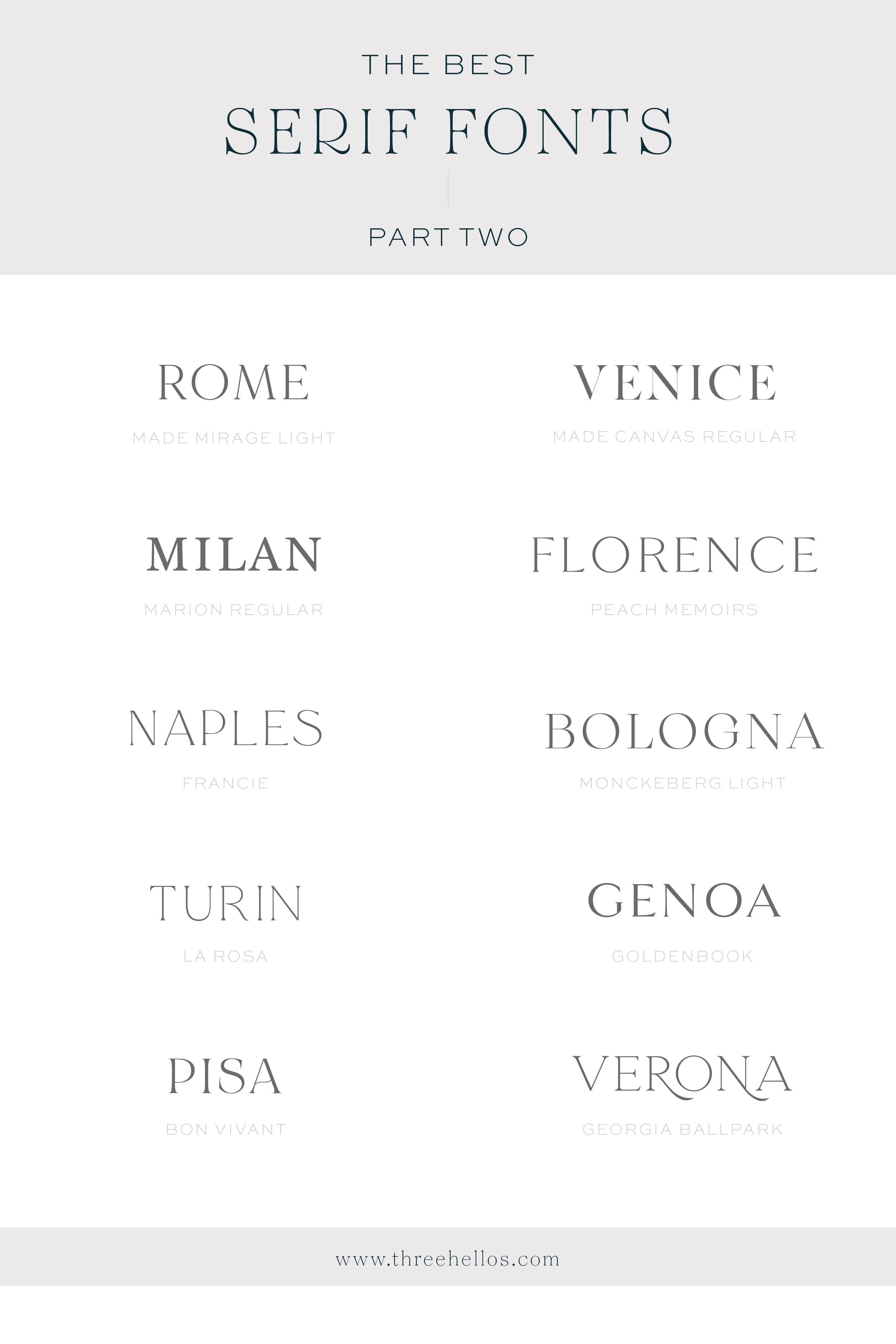
If you caught my first post about my favorite serif fonts for branding, you know I couldn’t possibly have fit all my faves into that post. It’s now time for the second installment of my favorite serif fonts for branding. These fonts are just as good as the first and include some of my recent faves!
And if you missed my first post, check that out here!
Serif fonts have structural details (sometimes called flourishes) at the end of each letter. Sans serif fonts (literally meaning without) do not have these. Serif fonts are considered more traditional, whereas sans serif fonts are typically more modern.
I think it’s really important to utilize a font in your branding that speaks to your brand story, the adjectives that define your business and ultimately appeals to your ideal client. I joke that I speak fluent font because I feel a definite sense of tone and emotion with every typeface. Your font choices can literally define your business and sets the perception for what type of client you may (or may not) attract.
Oh, and if you are looking for my top sans serif fonts, check out this post!
GRAB THE FONTS HERE:
MADE MIRAGE / MADE CANVAS / MARION / PEACH MEMOIRS / FRANCIE / MONCKEBERG / LA ROSA / GOLDENBOOK / BON VIVANT / GEORGIA BALL PARK
pro tip
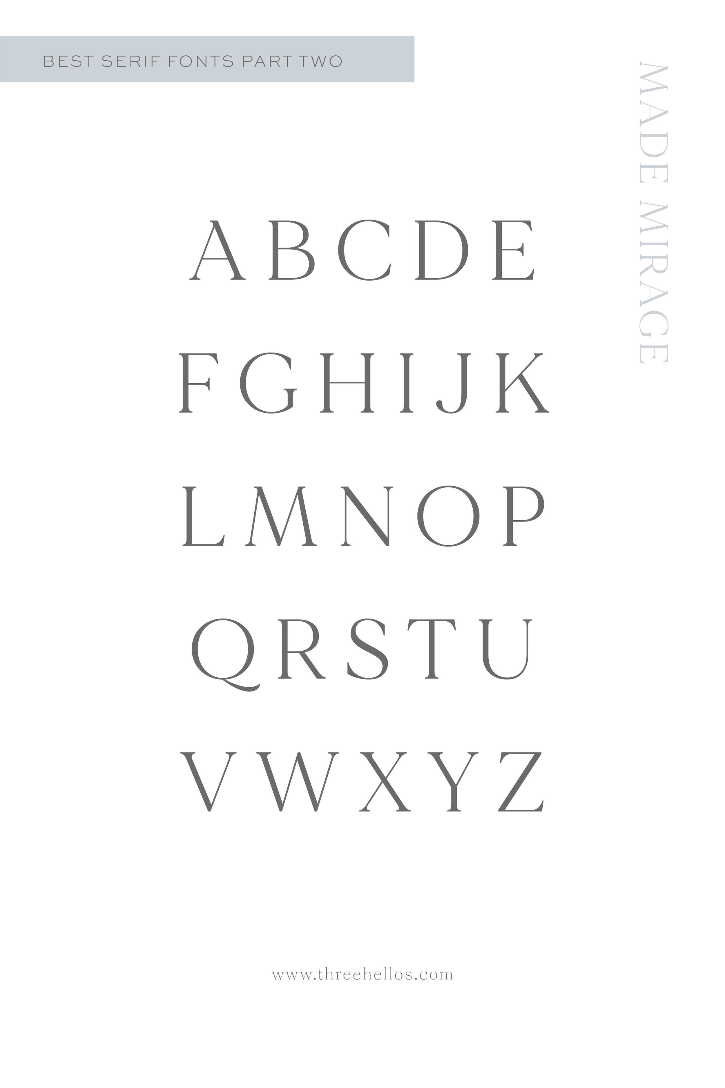
I always recommend a test drive of the font before purchasing if available. Type out words or the alphabet so that you can see all letterforms. I won’t lie, there have been times that I have liked a font until I saw how one letter was formed and it was ruined for me. The tiny details can really make a big impact when you are talking about font selection.
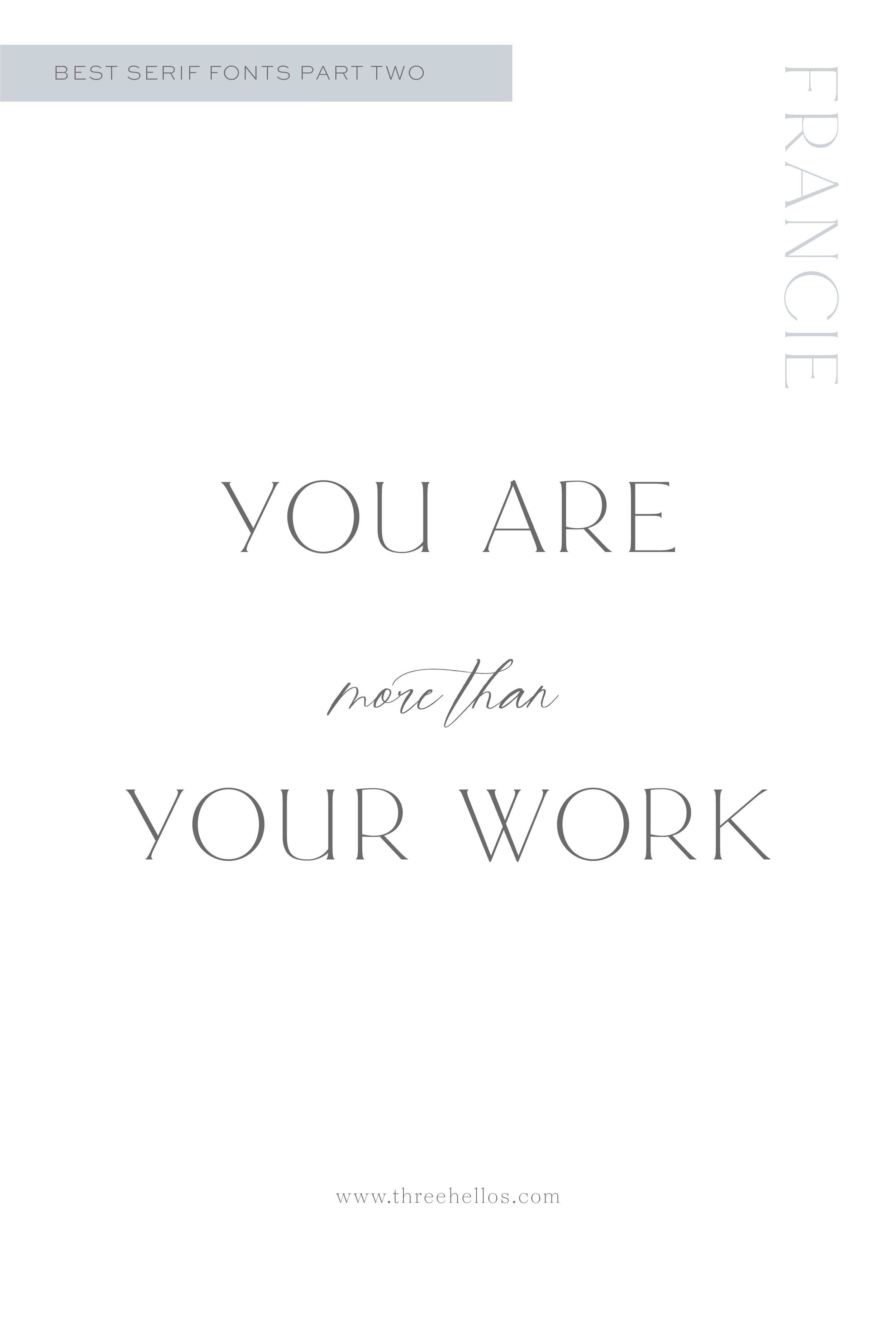
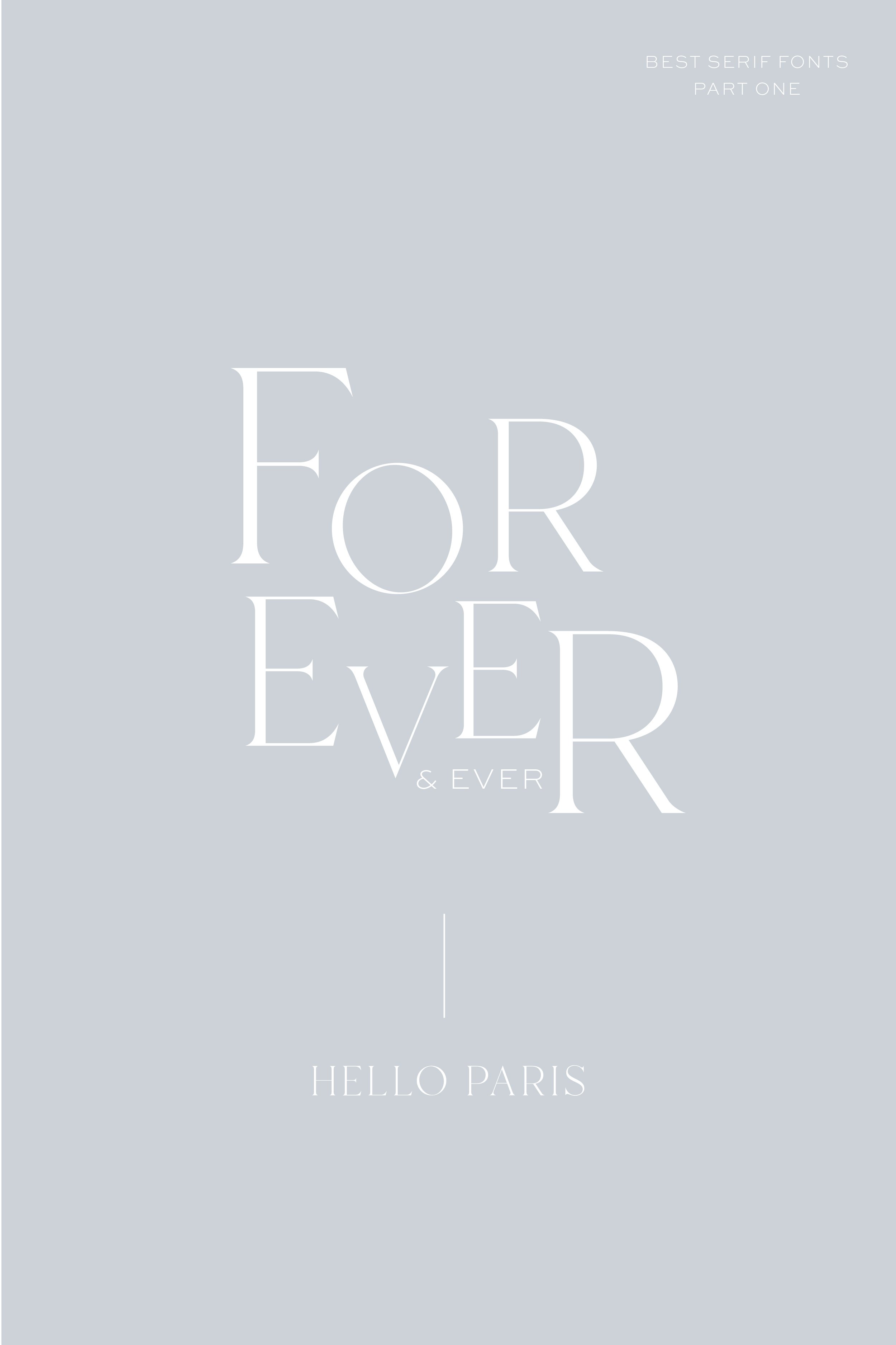
Here are a few graphics that utilize some of the fonts from my list so you can get a better visual and feeling for them. Pay attention to how they feel. Are the cold and stiff? Are they modern or vintage? Are they quirky or detailed? I also love when fonts utilize different weights and stylistic alternates. These make the typeface more robust and provide more longevity.


