The Best Serif Fonts for Branding Identity - Part One
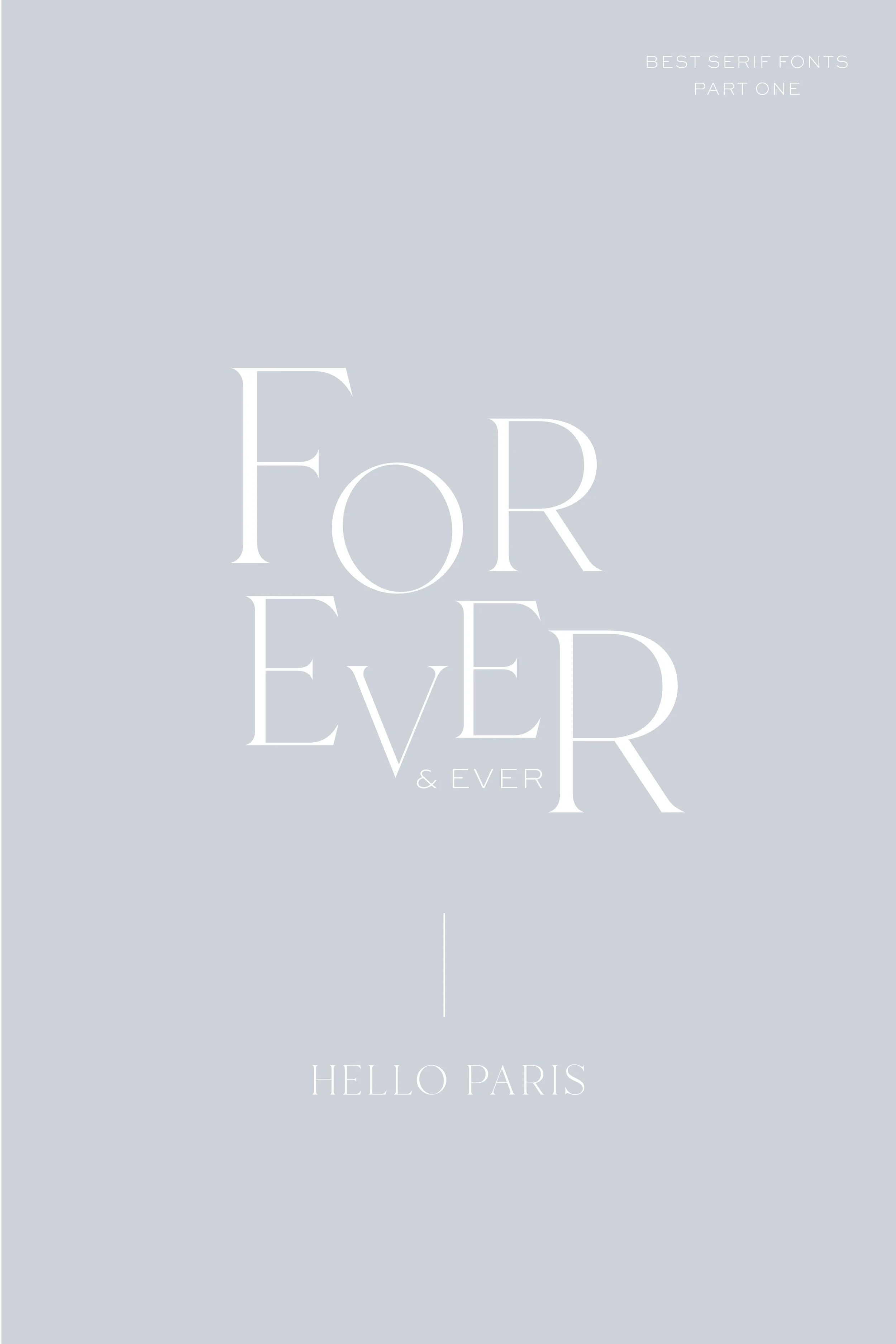
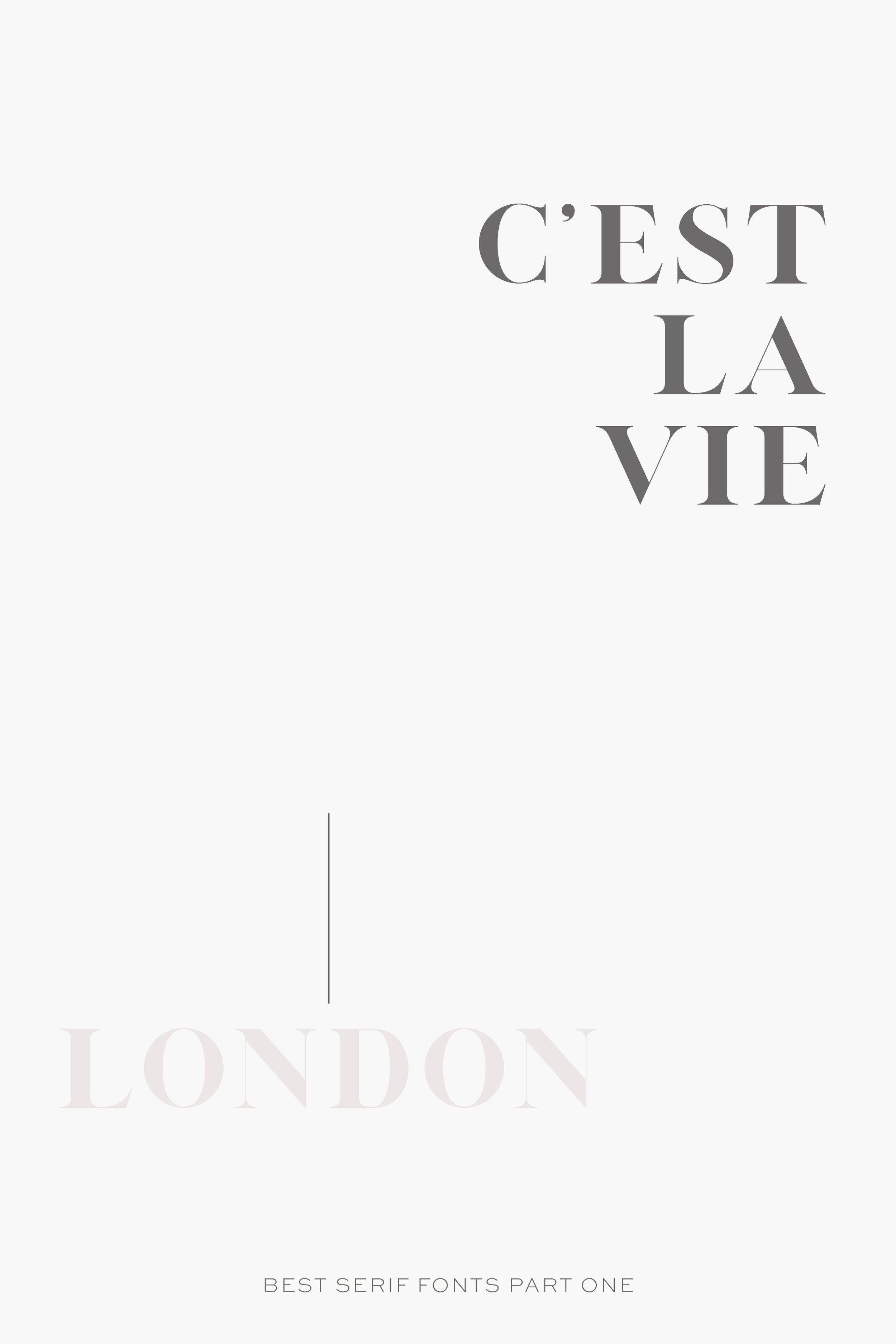
I’m guessing it is no secret that I’m a sucker for serif fonts. I love the upscale, sometimes historical feel that they can produce, especially for a brand. So I decided to compile a list of my favorites for you guys!
Serif fonts have structural details (sometimes called flourishes) at the end of each letter. Sans serif fonts (literally meaning without) do not have these. Serif fonts are considered more traditional, whereas sans serif fonts are typically more modern.
I’m a big believer in careful selection of the right typography for a project and the huge role that can play into your brand perception by potential clients and customers.
pro tip
I highly recommend that you test out the type prior to purchasing because something as simple as the way a certain letter is formed can impact how you feel when it comes to branding.
GRAB THESE FONTS HERE:
LONDON / JOANE REGULAR / HELLO PARIS / NAIVE MEDIUM / GIVENY / JOULES ET JACQUES / QUINCY CF LIGHT / RATCHERON / ABIGAIL / COLDIAC
another tip:
I’m a big believer in the careful selection of the right font or typeface and the huge role that can play into your brand’s perception.
I’m also a big believer that you can never have too many fonts on your computer. That does not go to say that you should go outside your brand fonts frequently because you risk losing the brand recognition we work so hard to build.


